CAFU 2022 / Phantom home screen
MY ROLE
Lead the product design from wireframes to final execution.
TEAM
Product Manager - Camilo Andres Botero
Core Squad dev team
Support from Product Design Lead
PROBLEM
CAFU is a fuel and other on-demand vehicle services platform, operating in the UAE since 2018. Despite being incredibly innovative and convenient, there was a challenge that the team faced in 2022:
Majority of the acquired CAFU app users never ordered any of the services.
After a deep dive into the data, some key issues were evident:
Fuel domination - many users knew and used CAFU only for fuel delivery - they simply ignored the other services like car wash, battery and tyre change.
Immediate conversion - new users who went through with ordering CAFU, did it within the first 15 minutes - users either ordered fast or we lost them, possibly forever.
Fast churn - the biggest drop in the flow was the first step where we asked for the user phone number - users were reluctant to give their number right after downloading the application.
Above all, we knew that the first time user experience was not a quick and pleasant one - in order to deliver fuel to the user, we needed them to create an account, know their vehicle details, ask for fuel type, get their exact location, and finally also the time slot preference - it was a long way to make the first order.
GETTING STARTED
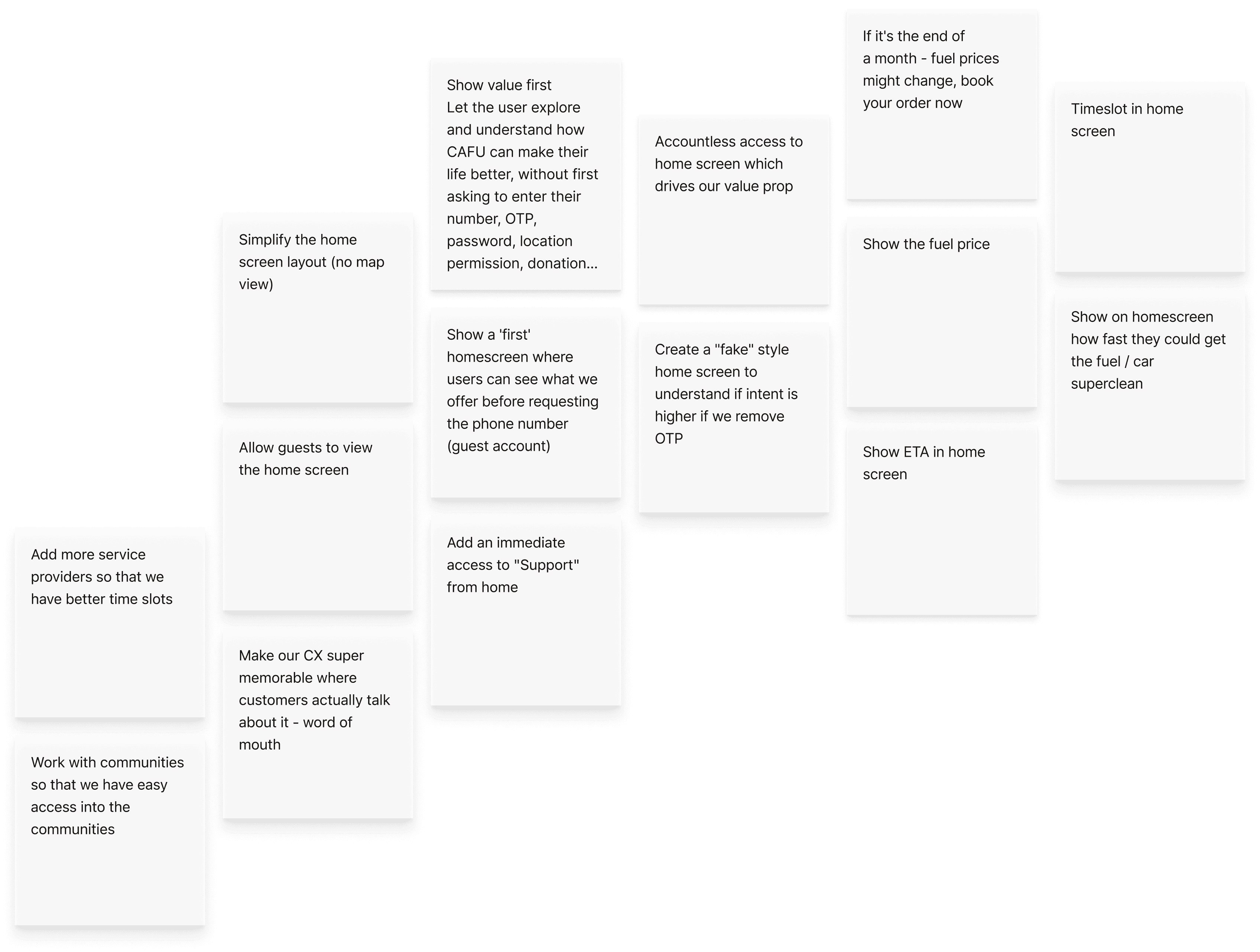
Product and design team came together for a brainstorm session with the goal to increase conversion. Different areas of improvement were uncovered - from app to operations.
However, it was clear to the B2C app team that we had to tackle the phone number step churn first. It was the root cause for the other two fore-mentioned hero problems - fuel domination and fast conversion…If we could get the user through sign up flow, they could see that we have other valuable services…If we could possibly skip the sign-up flow all together, users could faster get to ordering.
As the project had a tight deadline and research was relying heavily on data only, following hypothesis on users' pain-points were made:
New users might not understand the benefit of giving the phone number
New users might not understand CAFU's value proposition
New users might lack the incentive to try the value proposition
New users might not have UAE phone number
New users might be afraid of spam messages
REFRAMING THE PROBLEM
At first, several ad-hoc suggestions, to fix the problem, were made by the wider team. However, these were quickly crossed out due to technical limitations of the legacy platform.
Allow different sign up methods.
Allow account creation for foreign numbers.
Allow the user to access the app without creating an account.
These limitations brought us back to the hypothesis and formed the guiding question:
How might we show the value that CAFU has to offer, before the user goes through the sign up flow?
EXPLORATIONS AND ITERATIONS
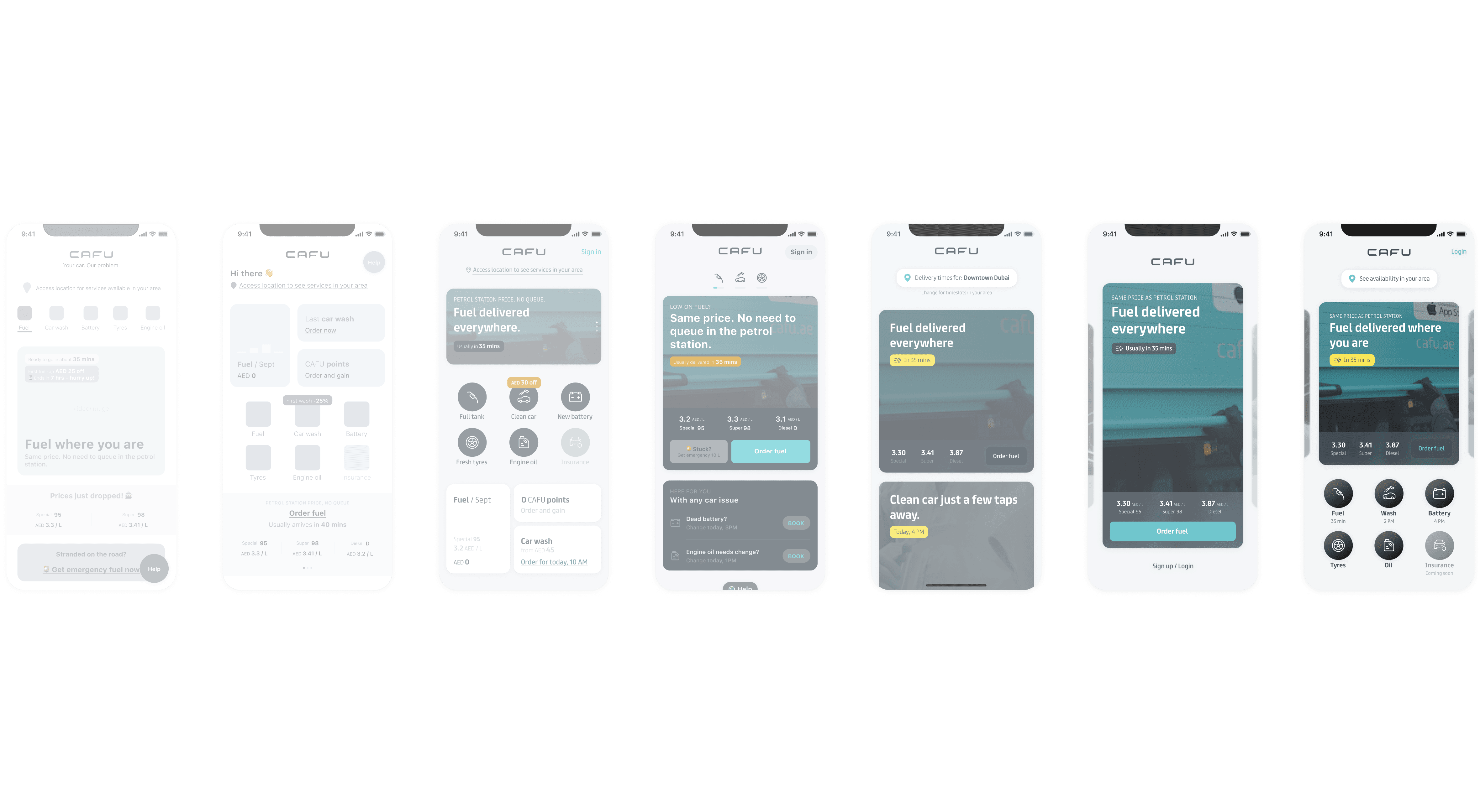
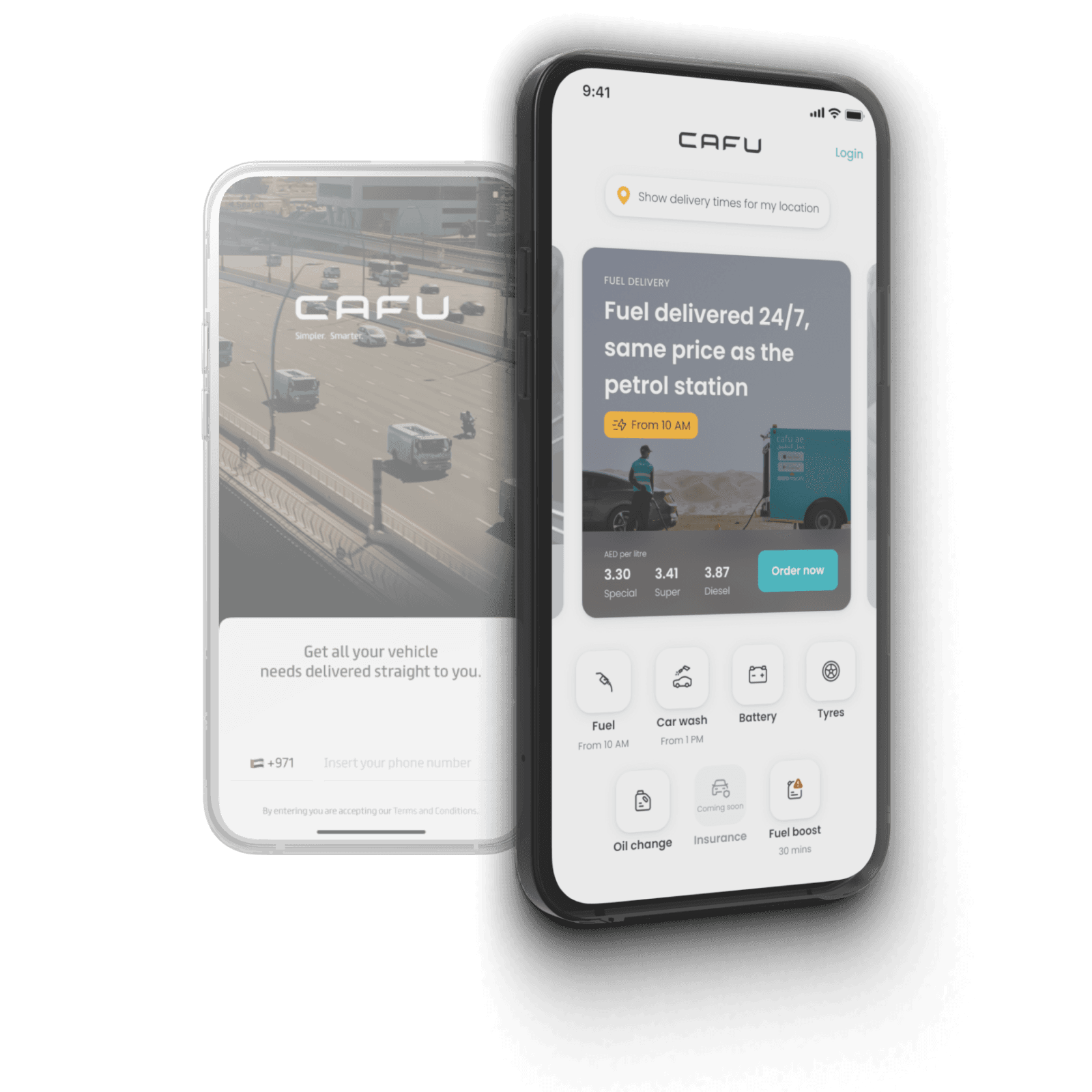
Initially I explored many different ways for the new landing page or so-called "phantom home screen". Concepts varied from service-focused hubs to personalized dashboards and from rich media marketing screens to information-heavy pages.
The mutual ingredient and goal was to - state a clear value proposition and make the app look barrier-less. However, since we knew that the whole app was going to get a revamp, it needed to act more as a learning space than final solution and thus, needed to be delivered in a few sprints. After a few iterations, we were close to delivering the legacy platform's phantom home screen.
Value proposition
One of our hypothesis was that users didn't really know what CAFU was about. The old landing screen had a nice, yet rather ambiguous video on the background, showing our fuel delivery trucks on the highway.
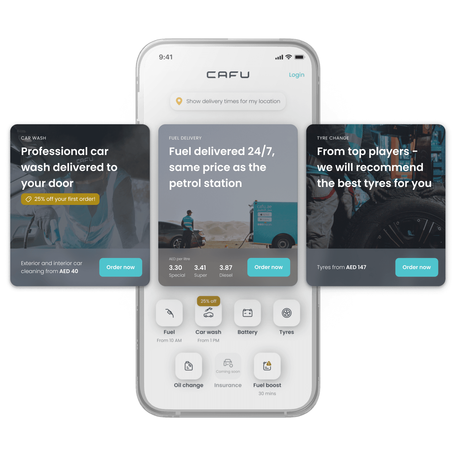
Thus, on the new phantom home screen we wanted to show the breath of our offering and all our services. We wanted to show to the user that we were more than a fuel delivery service, we wanted to show - CAFU is a one-stop shop for all your car services.
Location selector and ETA
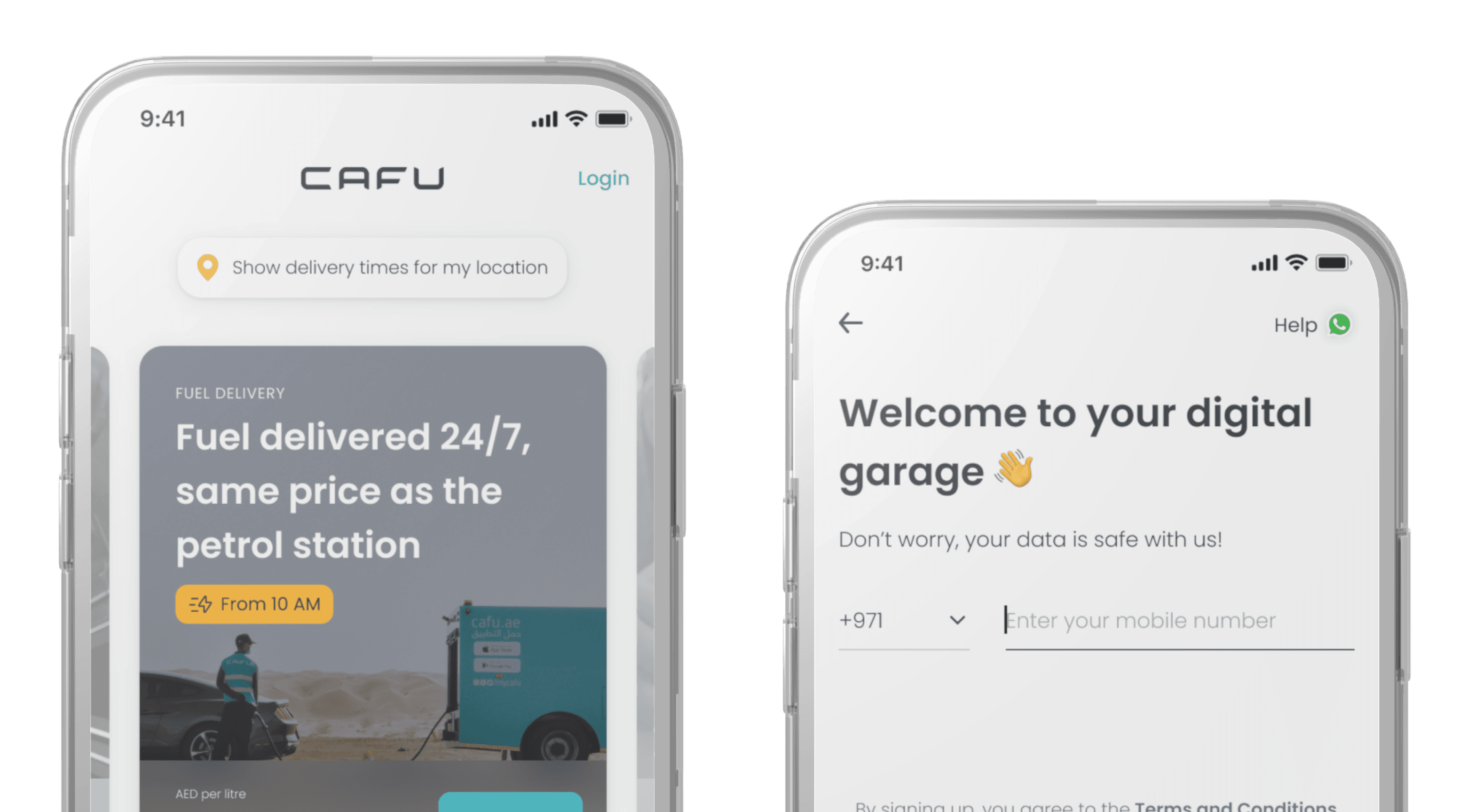
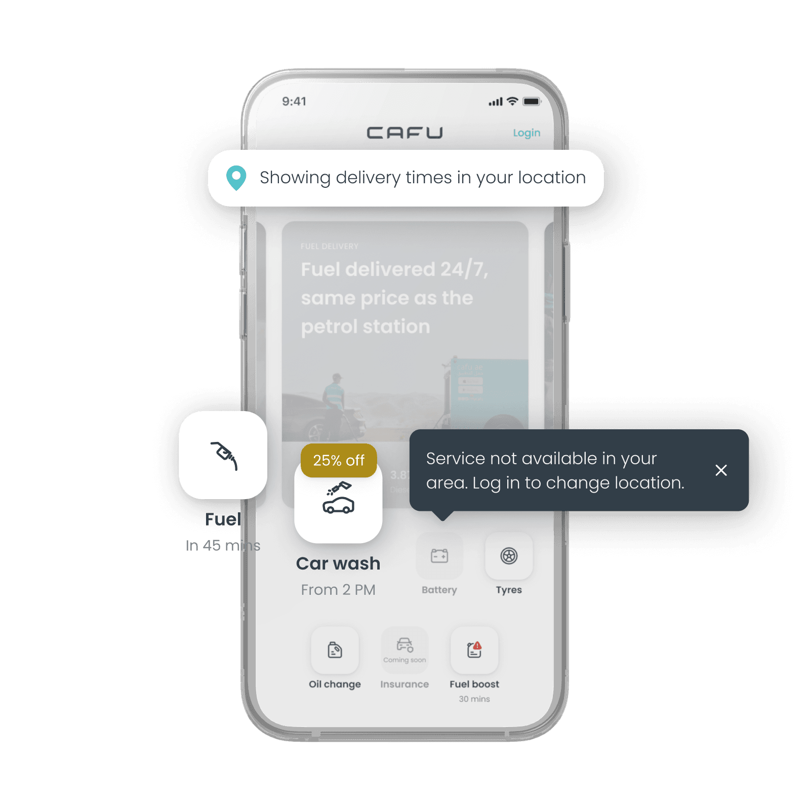
As our services vary from emirate to emirate as well as in zones within these emirates, to meet the user expectations early on, we wanted to give them the possibility to see which services are available in their location. Our data indicated that users usually ordered to their current location, so the idea was to use exactly that.
Since we now knew our user's location, we wanted to take it one step further and already show the earliest delivery times for our hero services. Again, the data showed that users usually chose the fastest time slot. So our hypothesis was that if they knew ahead that they can have the service quickly, that would push them to create the order.
Help and foreign numbers
Since the drop when asking for the phone number was huge, we wanted to get more insights into what exactly users were struggling with there.
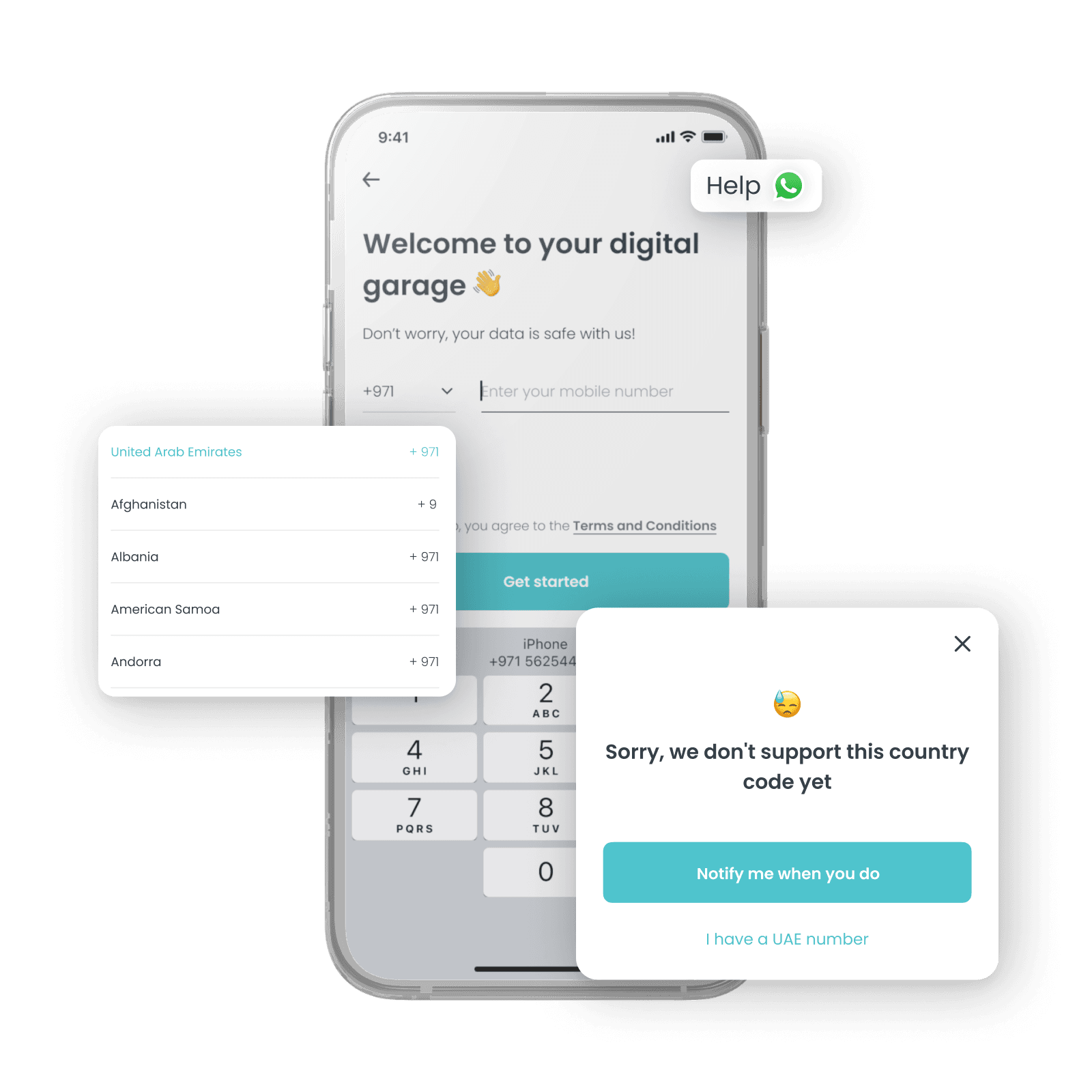
First, we added a touchpoint to get into contact with Customer Support - we saw it as a learning point for ourselves. Second, we allowed users to add foreign phone numbers, to understand if there was a real interest.
LAUNCH
In December 2022, the phantom home screen was launched. However, with considerable limitations.
We were never able to add the location functionality on the home screen due to tech and time constraints. Thus, we were not able to show the ETAs either.
Also, due to past issues, we could not actually allow the user to add their foreign phone number. Thus, also that was fostered more as a learning point for our future revamp.
IMPACT AND FINAL REFLECTIONS
Launching phantom home screen was one of my first important and profound projects in CAFU. In just a few weeks, there were countless challenges that lead to several iterations to overcome tech and time limitations.
Perhaps the most successful metric that this project helped us increase was that users started tapping more into our other services - the awareness that CAFU was not just a fuel delivery app increased. Small step was made, however there was still a long way to go.
Despite growing the awareness around our other services, users still dropped when we asked for their phone number. We managed to decrease the drop a little bit, however, perhaps more importantly, we got clear insights in designing CAFU 2.0 - we need to allow the user to place an order without stopping them, to make an account, right in the beginning of their journey.
🙋🏼♀️ The views expressed here are entirely my own and are not those of my employer.
©2024 • Sandra Tõnts
